Choosing the perfect colour palette for your wedding can be one of the most exciting yet challenging decisions. For 2025, we’re seeing fresh, elegant, and bold combinations that reflect the growing creative wedding trends.
Whether planning a classic celebration or something more modern, the right colour scheme can set the tone for your big day. Below are the top creative wedding trends and colour palettes for 2025, designed to inspire and guide you toward creating the wedding of your dreams.
Let’s Get Straight To The Point
Choosing the perfect wedding colour palette for 2025 can transform your celebration into a beautifully cohesive and personalised experience. From romantic blush pinks and gold to bold, vibrant combinations and nature-inspired hues, there are endless options to suit your style and venue.
The key is to create a palette that reflects your personality as a couple while ensuring it flows seamlessly throughout every aspect of your wedding, from the decor to the bridesmaids’ dresses. Ultimately, selecting a colour scheme is about crafting a day that feels uniquely yours, with colours that complement your love story and enhance your wedding atmosphere.
Popular Wedding Color Trends for 2025
Wedding colour trends evolve, offering fresh and exciting combinations that reflect new styles and sentiments. The key to selecting the perfect colours for your wedding day is understanding how they set the tone for your celebration and the atmosphere you want to create.
In 2025, popular wedding colour trends combine timeless elegance with modern vibrancy, providing couples with a range of options to make their big day truly memorable.
Blush Pink and Gold: A Match Made in Heaven for Summer Weddings
Blush pink and gold are an exceptional pairing for a summer wedding, offering a romantic and whimsical atmosphere that feels elegant and timeless. Blush pink brings a soft, feminine touch that evokes romance and serenity, while gold hints luxury and sparkle.
Together, they create a balanced and captivating palette perfect for warm-weather celebrations. This colour combination works beautifully in indoor and outdoor venues, particularly for couples who want to emphasise elegance without overpowering their guests with too bold of a scheme.
Soft Blue: Serenity Captured in a Color
Soft blue is one of the most calming colours in your wedding palette, evoking the peacefulness of a clear sky or the refreshing sensation of a dip in the ocean. The soothing nature of this colour makes it a perfect choice for couples seeking a serene, peaceful atmosphere.
Soft blue pairs wonderfully with other light, pastel tones for a delicate, airy feeling. It is also a versatile hue, complementing a variety of wedding themes, from coastal beach ceremonies to elegant garden affairs.
This colour can be beautifully incorporated through accents like wedding invitations, table linens, or a soft blue wedding dress.
Burnt Orange: A Unique Twist for Warmth and Vibrance
Burnt orange is a bold and vibrant hue that adds a unique twist to traditional summer wedding palettes, capturing the warmth of a summer sunset. This earthy colour is particularly striking when paired with bright, cheerful blooms like sunflowers or dahlias, which add layers of texture and visual interest to your wedding decor.
Burnt orange stands out while blending harmoniously with the season’s natural beauty, making it a perfect choice for couples who want to infuse their summer wedding with rich, lively energy. It’s an ideal option for outdoor or rustic weddings, particularly during late summer or fall when the colours of nature already embrace similar tones.
Green: A Grounding, Lush Hue that Reflects Summer’s Essence
Green, the colour of lush foliage, is the quintessential hue to incorporate into a summer wedding palette, mirroring the vibrancy and energy of the season. Green represents nature, renewal, and growth, making it the perfect grounding colour for your wedding decor.
Whether you choose rich emerald, sage, or a lighter mint tone, green can be integrated into nearly every aspect of your wedding, from floral arrangements to wedding party dresses or table centrepieces. This colour works well in traditional and modern wedding settings, especially with earthy tones like neutrals or bold accent colours like coral or yellow.
Classic and Timeless Color Palettes
The combination of ivory, champagne, and taupe works beautifully to create a cohesive and unified look across your entire wedding celebration. When considering your colour palette, it’s essential to think beyond just one element—these classic neutrals can seamlessly be used in flowers, decor, attire, and even invitations.
For example, bridesmaids can wear champagne-coloured dresses, while groomsmen wear taupe suits. Your wedding venue can be adorned with ivory linens and soft lighting, and even the wedding cake can be decorated in complementary neutral tones.
Ivory, Champagne, and Taupe: A Trio of Elegance
Ivory, champagne, and taupe form a classic, sophisticated colour palette that exudes timeless elegance, making it ideal for couples aiming for a refined, understated wedding look. These neutral shades complement one another perfectly, with ivory offering a soft, delicate foundation, champagne adding warmth and a touch of luxury, and taupe providing depth and balance.
This perfect colour palette and combination works well for various wedding styles, from formal black-tie affairs to relaxed, intimate gatherings. The palette ensures your wedding exudes sophistication without feeling too flashy or overwhelming, allowing the focus to remain on the beauty of the ceremony and your personal touches.
A Beautiful Backdrop for Wedding Flowers
Classic neutrals, such as ivory, champagne, and taupe, provide a beautiful backdrop for your wedding flowers to shine. These colours are subtle enough not to compete with the vibrant blooms in your floral arrangements, letting their natural beauty take centre stage.
Whether you choose bold florals like red roses or soft pastels like peonies and baby’s breath, these neutrals create a balanced and harmonious look. This makes the colour palette ideal for floral weddings, such as garden-themed or romantic outdoor ceremonies.
It’s a versatile choice for any flower arrangement, from the bridal bouquet to the table centrepieces, ensuring everything complements each other perfectly.
Clean and Classic Backdrop for Wedding Decor
Neutral shades like ivory, champagne, and taupe provide a clean, classic backdrop for your wedding decor, allowing other design elements, such as textures, floral arrangements, and lighting, to stand out. The simplicity of neutrals creates a sophisticated canvas, letting you add more personal touches to enhance the overall ambience.
The subtle nature of these shades also means they are timeless, making them a perfect choice for couples seeking a wedding look that won’t feel outdated in years to come.
Nature-Inspired Color Palettes
These natural hues are perfect for outdoor weddings, rustic-themed ceremonies, or any bride looking to embrace the essence of the great outdoors. Whether you’re exchanging vows under a canopy of trees, surrounded by rolling hills, or on the shores of a lake, nature-inspired colours help your celebration blend seamlessly into its surroundings.
The earthy tones complement natural elements such as wood, stone, and greenery, enhancing the overall atmosphere of your venue. For couples seeking an intimate, relaxed vibe, this gorgeous colour palette can bring the perfect balance of nature’s beauty and elegance to their special day, making it feel personal and harmonious.
Earthy Greens, Soft Blues, and Warm Terracottas: Serenity and Harmony
Nature-inspired colours like earthy greens, soft blues, and warm terracottas evoke a sense of serenity and harmony, making them the perfect colour palette for couples looking to infuse the beauty of the outdoors into their wedding. These colours reflect nature’s calming and peaceful elements, with green representing lush foliage, blue evoking the sky or water and terracotta capturing the warmth of the earth.
Together, they create a grounded and organic aesthetic, ideal for couples who want to celebrate their love in a tranquil, natural environment. Whether you’re hosting your ceremony in a botanical garden, a rustic barn, or even a beach setting, this palette brings the beauty of nature into your wedding design.
Lush Greenery and Earth-Toned Blooms
Imagine lush greenery and earth-toned blooms adorning your wedding venue, creating a soft and inviting atmosphere that feels fresh and timeless. Nature-inspired colour palettes allow flowers and foliage to take centre stage, with greens and earth tones as the perfect backdrop.
Earthy green tones, such as moss or olive, pair beautifully with deep browns and terracotta reds, while soft blues can complement delicate flowers like lavender or pale hydrangeas. This palette is ideal for couples who want their wedding to feel connected to nature, as it evokes images of a vibrant outdoor setting, with flowers blooming and the natural world flourishing around them.
Bold and Vibrant Color Palettes
Nature-inspired colours like earthy greens, soft blues, and warm terracottas create a serene and harmonious atmosphere, perfect for couples who want their wedding to reflect the beauty of the natural world. These shades, reminiscent of the outdoors, combine to form a calming and grounded aesthetic, offering a visual escape to nature without leaving your wedding venue.
Earthy Greens, Soft Blues, and Warm Terracottas: Serenity and Harmony
Earthy greens evoke the lush foliage of forests and gardens in summer, while soft blues recall the tranquillity of the sky or ocean. Warm terracotta tones add an earthy richness, reflecting the warmth of the earth.
These colours provide a peaceful, cohesive palette that complements various wedding themes, from bohemian and rustic to modern minimalism.
Ideal for Outdoor and Rustic Weddings
These natural hues are well-suited for outdoor weddings, rustic-themed ceremonies, or any bride looking to infuse the great outdoors into her celebration. Whether you’re exchanging vows beneath towering trees or in a barn with wooden beams, these colours seamlessly blend with nature’s beauty.
The palette complements organic materials like wood, stone, and floral arrangements, creating a visually cohesive and relaxing environment. Earthy tones like mossy greens and soft blues work especially well in open-air settings, enhancing the natural beauty of your surroundings.
Sage Green: A Serene and Calming Atmosphere
Sage green tones, in particular, are ideal for creating a serene and calming atmosphere, making it the perfect choice for a rustic or garden-themed wedding. The soft, muted shade of green evokes a sense of tranquillity and balance, creating a peaceful environment for your celebration.
This hue works beautifully alongside natural tones like soft ivory and blush pink or bold accents like copper or gold, offering elegance and calm. Its versatility makes it a favourite choice for couples who want a gentle, understated colour that enhances their outdoor or garden wedding vision.
Metallic and Monochromatic Color Palettes
Metallic accents like gold rose gold, and copper can elevate your wedding by adding a touch of luxury and sophistication. These shimmering metals bring an undeniable sense of opulence and glamour, creating a chic and contemporary vibe that enhances your wedding decor.
Gold exudes classic elegance, rose gold offers a romantic and slightly softer glow, and copper brings a warm, rustic appeal. Incorporating metallic accents into your wedding, from table settings and centrepieces to bridesmaids’ jewellery and wedding invitations, can create a striking contrast against softer hues, adding texture and depth.
Opulence and Chic Contemporary Vibes
Metallics are often chosen for their ability to bring a high-end, luxurious touch to a wedding, transforming an ordinary celebration into something extraordinary. The shimmering nature of metals like gold and copper creates a sense of opulence that immediately elevates the mood of the event.
This effect is especially apparent when used for accent pieces, such as metallic wedding bands, cake details, or floral arrangements with metallic-painted elements. Metallic colours can also be introduced through tableware, chargers, or candle holders, infusing a chic, contemporary vibe that makes your wedding feel modern and elegant.
Whether you’re going for a glamorous evening affair or a more understated luxury, metallic accents can bring just the right amount of shine and sophistication to match your wedding vision.
Monochromatic Color Schemes: Cohesion and Visual Appeal
Monochromatic colour schemes, which feature different shades of a single colour, can create a cohesive and visually pleasing look, ensuring your wedding feels harmonious and well-planned. By choosing various tones of one colour, you create a unified aesthetic that ties together all elements of your celebration, from the flowers to the attire and decor.
For example, a spectrum of blues—from soft pastels to deeper navy—can create a serene, tranquil atmosphere, while varying shades of blush pink offer a romantic and soft feel. This style of colour palette is perfect for couples who want to maintain a streamlined, elegant look without introducing too many competing hues.
Spectrum of Blues or Blush Pink: A Harmonious Touch
Consider a spectrum of blues or varying shades of blush pink for a subtle yet striking monochromatic palette. A range of blues—from pale sky blue to deeper navy—creates a layered, serene feel that’s perfect for beach, garden, or vintage-inspired weddings.
You can blend these hues in everything, ensuring each element complements the others while maintaining visual interest. Similarly, varying shades of blush pink—from soft peach to deeper rose—bring warmth and elegance to your celebration, creating a romantic atmosphere.
Pastel and Soft Color Palettes
Soft pastel shades like delicate lavender, serene mint green, and whimsical blush pink evoke a sense of romance and delicacy, making them ideal for couples who want a wedding that feels both dreamy and elegant. These gentle hues create a serene and calming atmosphere, perfect for couples looking to infuse a sense of lightness and elegance into their big day.
Lavender brings a soft, floral charm, mint green adds a fresh, airy quality, and blush pink creates a warm, romantic feel. Together, these colours bring a refined, soft beauty to the overall aesthetic of the wedding, allowing for a harmonious blend of colours that appeal to those seeking a subtle yet sophisticated look.
Creating a Fairy-Tale Wedding Look
Pastel shades are perfect for creating a fairy-tale wedding look, giving your celebration a magical, ethereal vibe that feels like a dream come true. These soft hues lend themselves beautifully to a whimsical, romantic theme, enhancing the atmosphere of a wedding venue and creating a picture-perfect scene.
Whether it’s through soft pastel floral arrangements or delicate table settings, pastels bring a touch of fantasy to every detail. This palette is ideal for outdoor garden weddings, whimsical barn ceremonies, or even sophisticated ballroom affairs with a fairytale-inspired twist, ensuring a sense of charm and wonder throughout the celebration.
Adding Whimsy and Romance
Pastel palettes are often associated with whimsy and romance, making them a popular choice for couples who want to inject a sense of light-hearted fun into their wedding day. The soft, faded nature of pastels gives a whimsical and enchanting quality to the event, allowing your decor and attire to feel both refined and playful.
Shades like soft peach, mint, and lavender pair beautifully together, creating a dreamy, ethereal atmosphere that invites joy and celebration. Whether you’re using pastels in floral arrangements, table settings, or wedding invitations, the colours help to convey a romantic, joyful mood while keeping everything light and fresh.
Timeless and Elegant Choice
Soft pastel shades are timeless and elegant, making them a popular choice for weddings of all styles and seasons. Their understated beauty ensures they never go out of style, making them a reliable and versatile option for creating a sophisticated, refined look that remains fresh year after year.
Whether it’s a spring garden wedding or a classic, all-year-round event, pastels have the ability to seamlessly fit into any theme or venue. Pastels also pair wonderfully with other neutral tones like ivory, champagne, or soft greys, allowing you to create a cohesive, sophisticated palette that feels timeless yet on-trend.
The elegance and versatility of pastel shades ensure that they will continue to be a popular wedding choice for years to come.
High-Contrast Color Combinations
Combining unexpected colour pairs can create a visually striking and bold wedding theme that stands out. High-contrast colour combinations use opposing or unconventional hues that immediately draw attention, making your wedding decor memorable and unique.
By mixing colours that are on opposite ends of the colour wheel or that aren’t typically paired together, you can add visual excitement and energy to the entire celebration.
Captivating and Playful Pairings
Pairing cool aqua with fiery orange or soft lavender with bold mustard creates a captivating and playful palette that exudes energy and creativity. These unexpected colour pairings challenge traditional expectations and offer a fresh twist on the usual wedding themes.
Aqua and orange, for instance, create a dynamic visual effect, with the coolness of aqua contrasting sharply with the warmth of orange. Similarly, delicate lavender and mustard are a striking combination that brings a touch of whimsy and fun, with lavender’s cool, muted tone offset by mustard’s bold vibrancy.
High-Contrast Multi-Color Palettes: Unexpected Decor
High-contrast multi-colour palettes offer a chance to make your wedding day decor feel unexpected and imaginative. By incorporating several bold, vibrant hues into your colour scheme, you can create a dynamic and exciting atmosphere that feels fresh and original.
Think of combining hues like emerald green, fuchsia, and electric blue for a lively celebration, or mix deep purples, fiery reds, and rich golds for an elegant yet dramatic look. The contrast between multiple colours ensures that no one element of your wedding decor feels too predictable, encouraging guests to admire the boldness of your choices.
High-contrast multi-colour palettes allow for creativity to shine, helping your wedding decor feel one-of-a-kind.
Adding Excitement with Obscure Color Combinations
Obscure colour combinations like underripe green and faded lavender or peppery burgundy and happy-go-lucky yellow can add a touch of excitement and intrigue to your wedding celebration. These unconventional colour pairings create a sense of surprise and charm, making your wedding feel distinct and special.
The understated nature of underripe green paired with faded lavender offers a soft but unexpected contrast, while the combination of burgundy and yellow can add warmth and energy to the overall look. These offbeat combinations can be used to highlight certain features of your wedding, from the flowers and cake to linens and table settings, offering a bold and unexpected aesthetic that leaves a lasting impression.
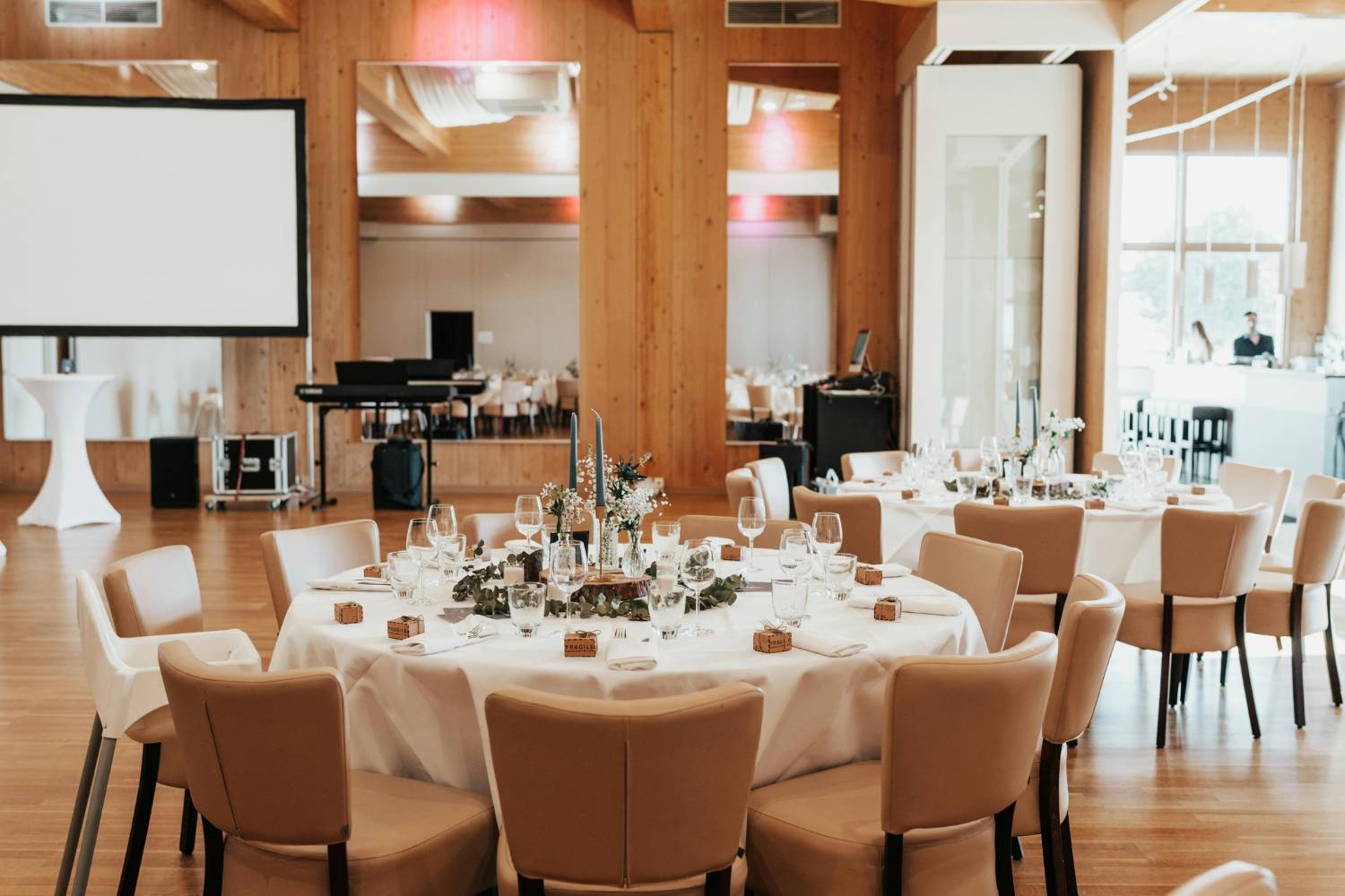
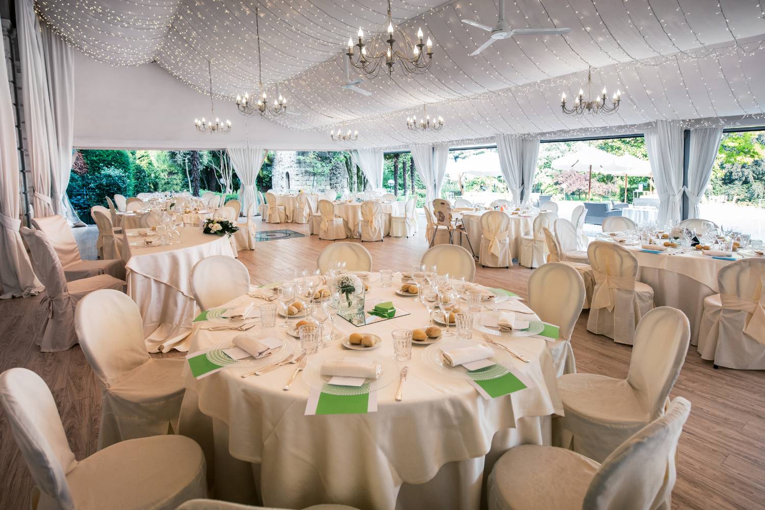
Wedding Decor Inspiration
From wedding flowers to your invitation designs to your reception centrepieces, the colour palette you choose can easily integrate throughout your wedding day and all the communication leading up to it.
Color Palette Integration Throughout Your Wedding
The colour scheme you select sets the tone for the entire celebration, allowing all elements—big and small—to harmonise. This integration ensures that every detail feels intentional and well-planned, providing a seamless experience for your guests as they move from one part of your celebration to the next.
Incorporating Color into Your Decor, Stationery, and Attire
Think about incorporating your colour choices into your wedding decor, stationery, and attire to enhance the overall aesthetic. From the wedding invitations to the floral arrangements and even your wedding dress, colour is a powerful tool in creating visual harmony.
Customising your decor and stationery with your chosen colour palette allows you to create a consistent visual theme that runs throughout the event. For instance, you can use your primary wedding colours in your invitation suite, matching them with your bridal bouquet, bridesmaid dresses, and table centrepieces.
Tying Together Wedding Elements with Color
Your colour palette can be a great way to tie together all the different elements of your wedding, from the venue decor to the smallest decorative accents. By selecting complementary colours that work across multiple elements, such as the floral arrangements, the table linens, lighting, and even the cake, you create a unified aesthetic that feels balanced and intentional.
Whether you choose a classic monochromatic scheme or an adventurous mix of high-contrast hues, your colour choices serve as the unifying force that links everything together. For example, if you’ve chosen a blush pink and gold palette, you can reflect these colours in your floral centrepieces, bridal accessories, and reception table settings, ensuring that each detail works in harmony.
Adding a Personal Touch to Your Wedding
Your colour palette is a great way to add a personal touch to your wedding, reflecting your style, personality, and the significance of the day. Choosing colours that resonate with you as a couple helps make the wedding feel even more meaningful.
Whether it’s the colours of a place that holds special memories or shades that represent certain emotions, using your colour palette as a personal expression adds an intimate layer to your celebration. For example, couples may choose a colour that signifies a shared experience or interest, such as the colours of a favourite season, destination, or hobby.
Bridesmaid Dresses and Color Palettes
Bridesmaid dresses can serve as a foundation for other elements of the wedding, like floral arrangements, décor, and even the groom’s attire, creating a unified and visually appealing design throughout the event.
Complementing Your Wedding Colour Palette
Choose bridesmaid dresses that complement your wedding colour palette to create a cohesive and harmonious look throughout your celebration. Bridesmaid dresses should reflect the overall aesthetic of your wedding, helping to reinforce the chosen colours and setting the tone for the entire event.
For example, terracotta dresses work wonderfully with an earthy, desert-inspired wedding, creating a warm and rustic feel that ties into the natural surroundings. The colour of the dresses doesn’t need to be an exact match to your primary wedding colours but should complement them to ensure all the elements of the wedding work together seamlessly.
Considering the Season and Venue
When selecting bridesmaid dresses and colour palettes, it’s essential to consider the season and venue of your wedding to ensure the right colours and fabrics are appropriate. The season you choose for your wedding can greatly influence the tones you select for the dresses.
For instance, lighter pastel shades like blush or soft lavender work beautifully for spring or summer weddings, while deeper, richer tones like burgundy or navy are perfect for fall or winter celebrations. Similarly, the venue can impact the choice of the colour palette; a beach wedding might call for breezy, light colours like aqua or soft peach, while a rustic barn or vineyard wedding could inspire deeper, earthier tones such as olive green or mustard yellow.
Incorporating Wedding Colors into Bridesmaid Attire
Bridesmaid attire can be a great way to incorporate your wedding colours into your overall aesthetic, adding depth and dimension to the overall look of the day. Bridesmaid attire provides an opportunity to showcase your colour palette in a meaningful way, from soft and subtle hues to bold, statement-making shades.
You can go for a monochromatic look, where all bridesmaids wear dresses in varying shades of the same colour, or opt for a mix-and-match approach, where each bridesmaid wears a dress in a complementary colour from the palette.
Creating a Unique Colour Palette
If you have a shared love for art, vibrant hues like royal blue and gold might take centre stage. Personalisation ensures that your wedding stands out, creating a one-of-a-kind event that guests will remember for its unique flair and emotional depth.
Reflecting Your Personality and Style
Choose wedding colours that reflect your personality and style as a couple to ensure your wedding feels personal and meaningful. Your wedding colour palette is an opportunity to express who you are as a couple, showcasing the values, interests, and aesthetics that are important to you both.
For example, if you share a love for nature, you might select earthy tones like greens, browns, and creams to create a rustic, organic atmosphere. If you’re drawn to bold, contemporary design, bright and contrasting colours like emerald green and hot pink may feel more aligned with your style.
Personalising Your Colour Palette
Personalising your colour palette creates a wedding that’s uniquely yours, ensuring that every element of your celebration feels deeply connected to who you are. Incorporating elements that are significant to you both—whether it’s a favourite travel destination, shared memories, or a specific passion—into your color choices can help tell your love story.
For example, a couple who met at a beach might choose shades of aqua, sand, and coral to evoke the seaside feeling.
Mixing, Matching, and Experimenting
Mix and match colours, experiment, and enjoy the process of creating a day that tells your love story through your chosen colour palette. Don’t be afraid to step outside traditional wedding colour combinations and explore the endless possibilities.
Consider blending a variety of tones, from light pastels to bold accents, or even mixing metallics with neutrals. This approach allows for creativity and fun while giving you the freedom to express different aspects of your relationship.
For example, combining deep navy with blush pink and touches of gold creates an elegant and modern contrast.
Considering Season, Venue, and Atmosphere
Consider the season, venue, and overall atmosphere you want to create when selecting your colour palette, as these factors will influence your choices. The season provides natural guidance for colour selection, with warmer, richer tones like plum, deep red, or mustard being ideal for fall, while lighter hues such as peach, lavender, and mint work wonderfully for spring.
Similarly, your venue plays an important role—an elegant ballroom might call for a more formal, monochromatic colour scheme, while a rustic barn may inspire a more earthy, casual look.
Selecting the perfect wedding colour palette for 2025 is about more than just aesthetics—it’s about creating a mood, telling your love story, and ensuring every element of your celebration feels cohesive and personal. With a variety of trends ranging from classic neutrals and nature-inspired hues to bold, high-contrast combinations, couples have endless possibilities to design a wedding that reflects their vision and style.
Whether you’re drawn to soft pastels for a fairytale romance, earthy greens for a rustic charm, or luxurious metallics for an elegant affair, your colour choices will set the tone for an unforgettable day. By considering the season, venue, and your own unique personality, you can craft a colour palette that not only enhances your wedding’s aesthetic but also leaves a lasting impression on you and your guests.