Colour is one of the most powerful tools in event design, influencing emotions, shaping perceptions, and creating memorable experiences. Whether planning a corporate gala, a wedding, or a product launch, understanding the psychology of colour can help you design an event that resonates with attendees.
Let’s Get Straight To The Point
Colour plays a significant role in event space design, impacting the mood, atmosphere, and emotions of attendees. By understanding colour psychology, you can craft an event that resonates deeply with your guests.
From corporate settings to charity events to celebratory gatherings, the right colour choices can reinforce a theme, enhance branding, and create an unforgettable experience. Consider your audience, the event’s purpose, and the emotional triggers associated with different colours, and you’ll be on your way to designing an event that leaves a lasting impression.
Understanding Color Psychology
Colour psychology explores how different hues affect emotions and behaviours. In design, colours play a vital role in setting the mood, reinforcing branding and identity, guiding guest experiences, and creating a lasting emotional impact.
By selecting colours strategically, event planners can elevate the atmosphere of an event, making it more immersive and engaging.
The Emotional Spectrum of Colors
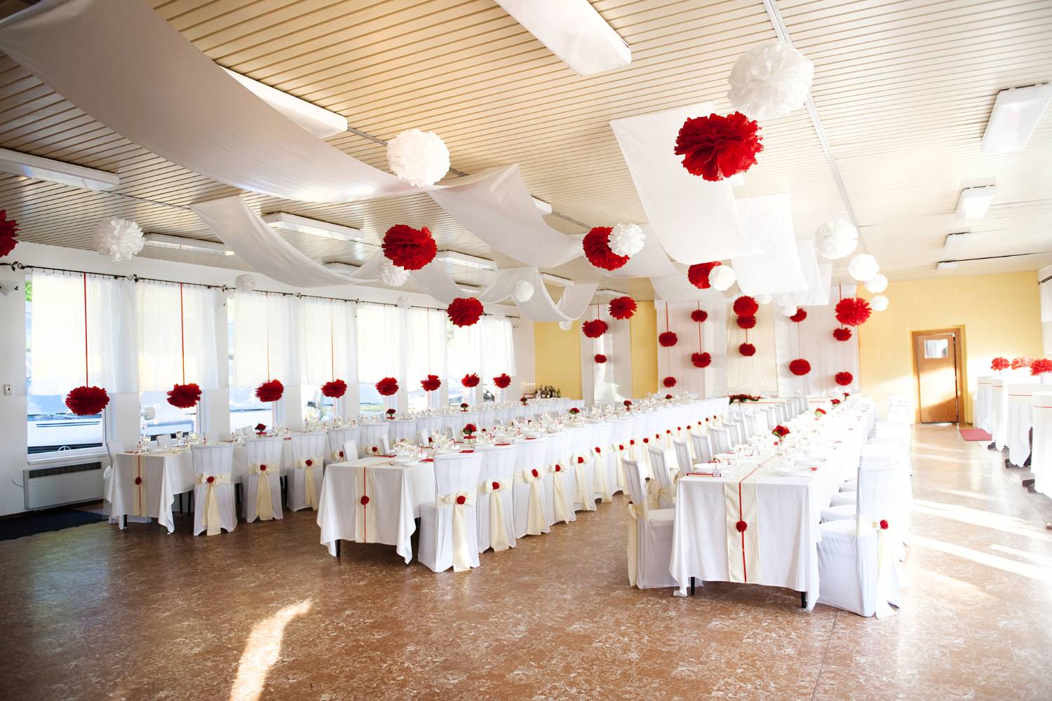
Each colour carries its own psychological meaning and can elicit different emotions. Red is often associated with strong emotion, passion, energy, and excitement, but it can also signify urgency or danger, making it ideal for high-energy or bold events.
Blue, on the other hand, is a versatile colour that evokes calmness, trust, and professionalism, making it a popular choice for both corporate functions and networking events. Green symbolises nature, renewal, and health, making it well-suited for eco-friendly or wellness events.
Yellow is a bright, optimistic colour that can create a joyful atmosphere but can be overpowering if overused, making yellow great for playful and summer-themed gatherings.
Purple represents luxury, creativity, and mystique, which is why it’s often seen in VIP events or galas. Black, often used for its sophistication, power, and elegance, is a staple in formal and upscale events.
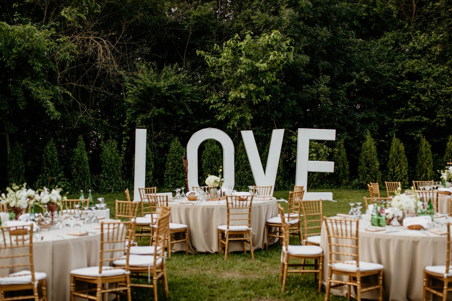
White evokes purity and simplicity, often chosen for weddings or minimalist designs. Understanding these emotional associations helps planners craft the perfect ambience for any gathering.
Colour Choices for Corporate Events
Corporate events require a balance of professionalism and engagement. Navy blue is a favoured choice for corporate settings, conveying trust, dependability, and professionalism.
Neutral shades like beige, grey, and white create a calm, sophisticated atmosphere, making them great backdrops for business meetings or seminars. Accent colours such as orange and green inject vibrancy and energy into corporate spaces, perfect for events that require a boost of creativity or innovation.
Additionally, aligning an event’s colour palette with a company’s branding strengthens brand recognition and creates a cohesive, unified experience for attendees.
Applying Color Psychology in Event Planning
To use colour effectively in design, start by defining the purpose of the event. A luxury gala, for example, may call for deep, rich hues, while a wellness retreat might benefit from soft greens and blues to create a calm and restorative environment.
Knowing your audience is also essential. Different groups may have varying emotional triggers and colour preferences, so it’s crucial to consider cultural meanings and personal connections to certain colours.
A colour wheel can be a helpful tool when selecting colours and other colours that work well together. Complementary colours, which are opposite each other on the wheel, create contrast and are considered attention-drawing colours, while analogous colours, those next to each other, form a harmonious and balanced palette.
Consistency is key, so it is important to apply colour principles to various design elements, such as decor, lighting, and branding, to create a cohesive aesthetic and experience.
Creating Atmosphere and Mood with Color
The event space plays a significant role in determining how colour will be used. In dark and small rooms, bright and bold colours can add energy and vibrancy, creating a more dynamic atmosphere.
On the other hand, large, open spaces may benefit from more muted tones to avoid feeling too overwhelming or chaotic. Lighting can further enhance colour schemes, as warm or cool lighting can change the way colours appear, making a huge difference in the atmosphere.
By understanding the emotional impact of colours, event planners can use them to evoke specific feelings and desired emotions in their guests, whether that’s excitement, calmness, or joy. Whether for a celebratory event, a corporate gathering, or a charity fundraiser, colour can be a key tool in shaping the overall mood of the experience.
Tips for Choosing the Right Colors
When selecting colours for an event, knowing your audience and their preferences is crucial. Demographics, cultural meanings, and the overall theme of the event should influence your choices.
Seasonality is another factor to consider. Warm tones and earth tones work well for autumn events, while lighter, more pastel shades are perfect for spring.
To maintain a cohesive and professional look, it’s best to limit your colour palette to just a few shades.
Experimenting with contrasts can also add visual interest and make certain areas of the event stand out. However, it’s important not to overwhelm guests with too many contrasting colours, as it can lead to visual chaos.
Finding the right balance is key to creating a memorable event experience.
Advanced Color Schemes for Event Design
For more sophisticated and dynamic colour schemes, consider using a monochromatic palette, where different shades of a single colour create a minimalist and elegant design. An analogous colour scheme, which involves using colours next to each other on the colour wheel, creates a serene and harmonious effect.
Complementary colours, being opposite colours on the wheel, offer high contrast and can create dramatic focal points in the space.
A split-complementary scheme uses a base colour and two adjacent colours, offering a balance of contrast and harmony. For a vibrant and lively event, a triadic colour scheme, which consists of three evenly spaced colours, can add energy and creativity to the overall design.
Real-World Examples of Effective Color Use
Many brands and events have successfully used colour to reinforce their identity and make an impression. Tiffany & Co. uses a signature blue that exudes luxury and exclusivity, while McDonald’s uses red and yellow to stimulate energy and appetite.
In themed events, like a Vegas-themed event, bold reds and golds can set the tone, while an underwater-themed event might lean toward blues and purples to evoke the calming nature and mysterious feeling of the ocean.
Best Practices for Event Design
To ensure that colour plays an impactful role in event space design, always use colour psychology thoughtfully. The colours you choose should align with the event’s goals and the emotional atmosphere you want to create.
Avoid overusing a single colour, as it can become overwhelming or monotonous. Instead, use colour to evoke desired emotions and guide the experience, enhancing specific areas of the event, such as lighting, signage, or focal points.
By considering these principles, you can create an event that not only looks stunning but also deeply resonates with your guests, leaving a lasting impression.
Conclusion
In conclusion, colour is an essential and powerful tool in event design, offering more than just aesthetic appeal. By understanding the psychology behind different hues, event planners can create atmospheres that evoke specific emotions, enhance guest experiences, and strengthen brand identities.
Whether aiming to inspire excitement, calm, or creativity, the careful selection and strategic application of colour can significantly shape the mood and success of any event. By considering factors such as audience preferences, the purpose of the event, and the space in which it occurs, planners can craft memorable, immersive experiences that leave a lasting impact.
Ultimately, colour is not just about making an event visually appealing—it’s about using colour to tell a story and elevate the entire experience.
Frequently Asked Questions
What Is Colour Psychology in Design?
Colour psychology in design refers to the use of colours to evoke certain emotions and create the desired atmosphere. It helps planners choose colours that align with the event’s purpose and target audience.
How Do Colors Affect the Mood of an Event?
Different colours can trigger various emotional responses. For example, blue can create calmness and trust, while red can evoke passion or excitement, influencing the overall mood and energy of the event.
What Are Some Popular Colors for Corporate Events?
Navy blue, beige, grey, and white are popular for corporate events as they convey professionalism and trust. Accent colours like orange, purple, or green can add vibrancy and creativity.
How Can I Use Color to Create an Atmosphere at My Event?
By choosing colours that align with the desired mood, such as bright colours for energy and soft tones for a calming atmosphere in your event. Lighting, decor, and branding can all be enhanced by using colour.
What Are Advanced Color Schemes?
Advanced colour schemes include monochromatic, analogous, complementary, split-complementary, and triadic. Each offers different levels of contrast, harmony, and visual interest to create a unique atmosphere for your next event, too.

